Sooki Sesame Oil
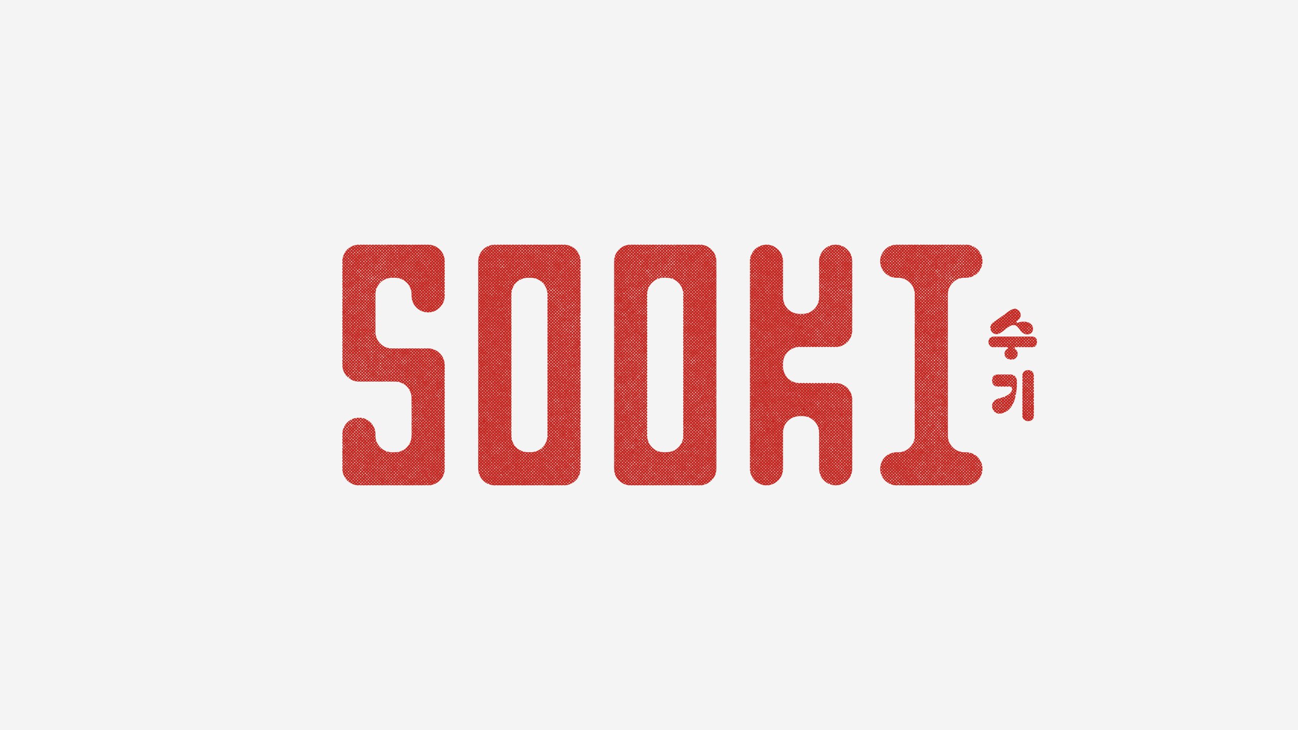
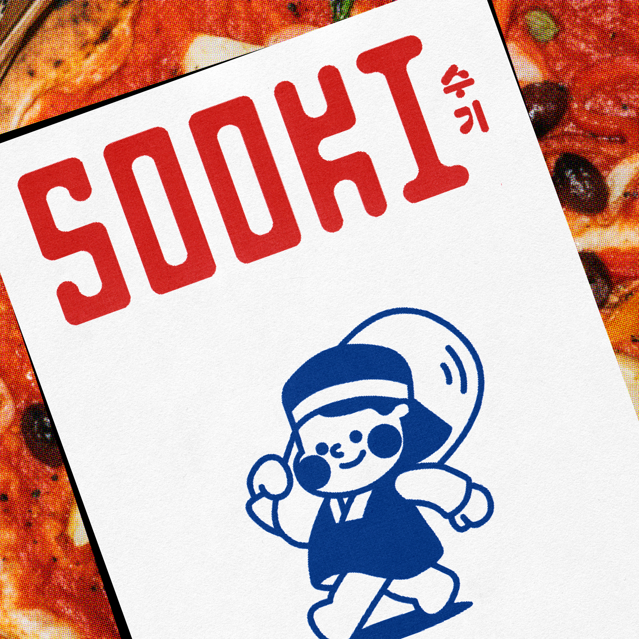
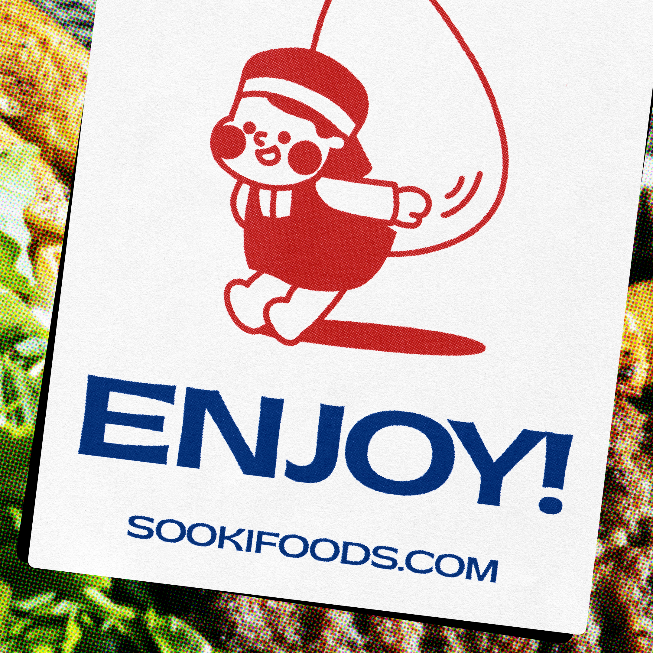
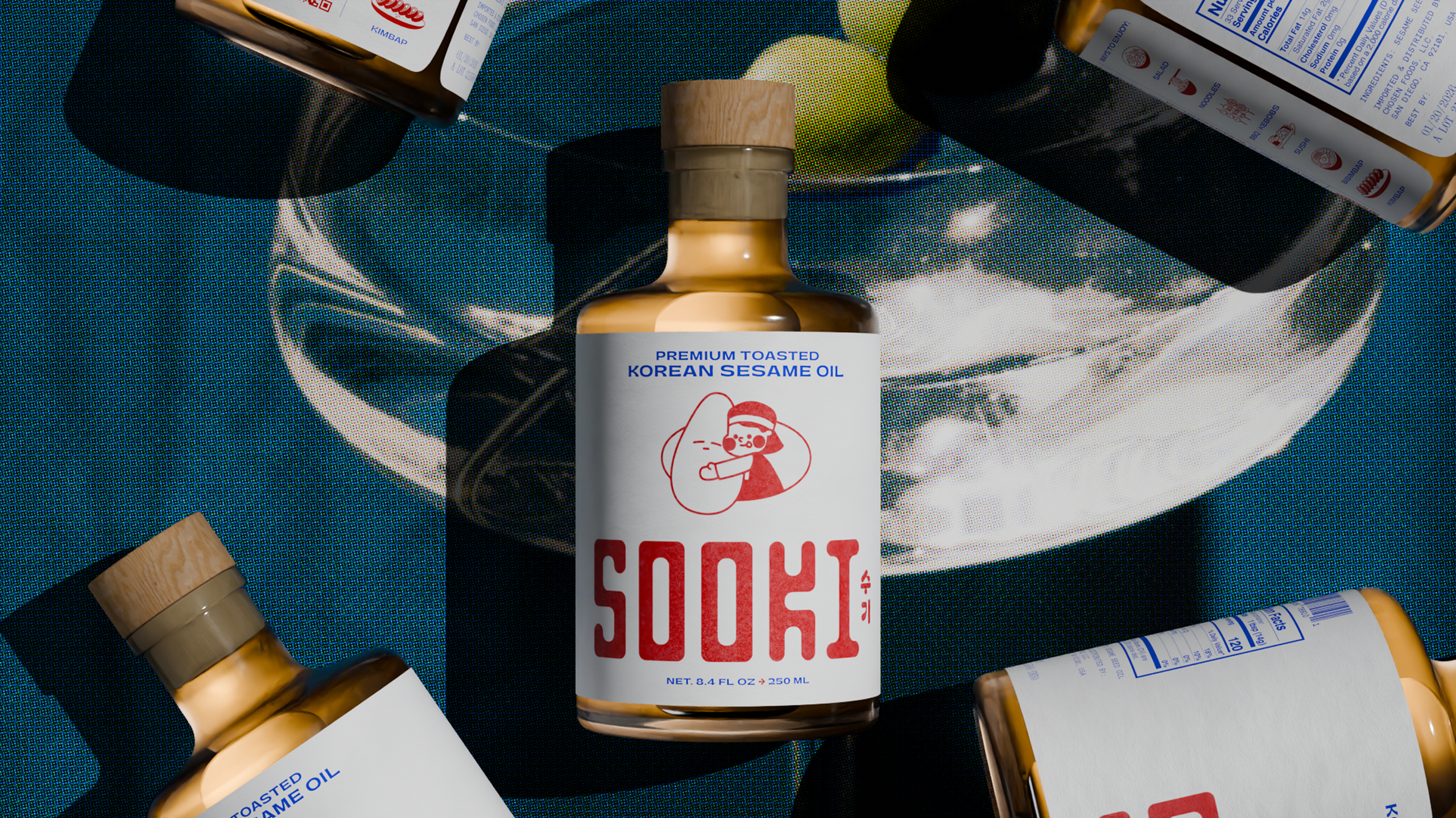
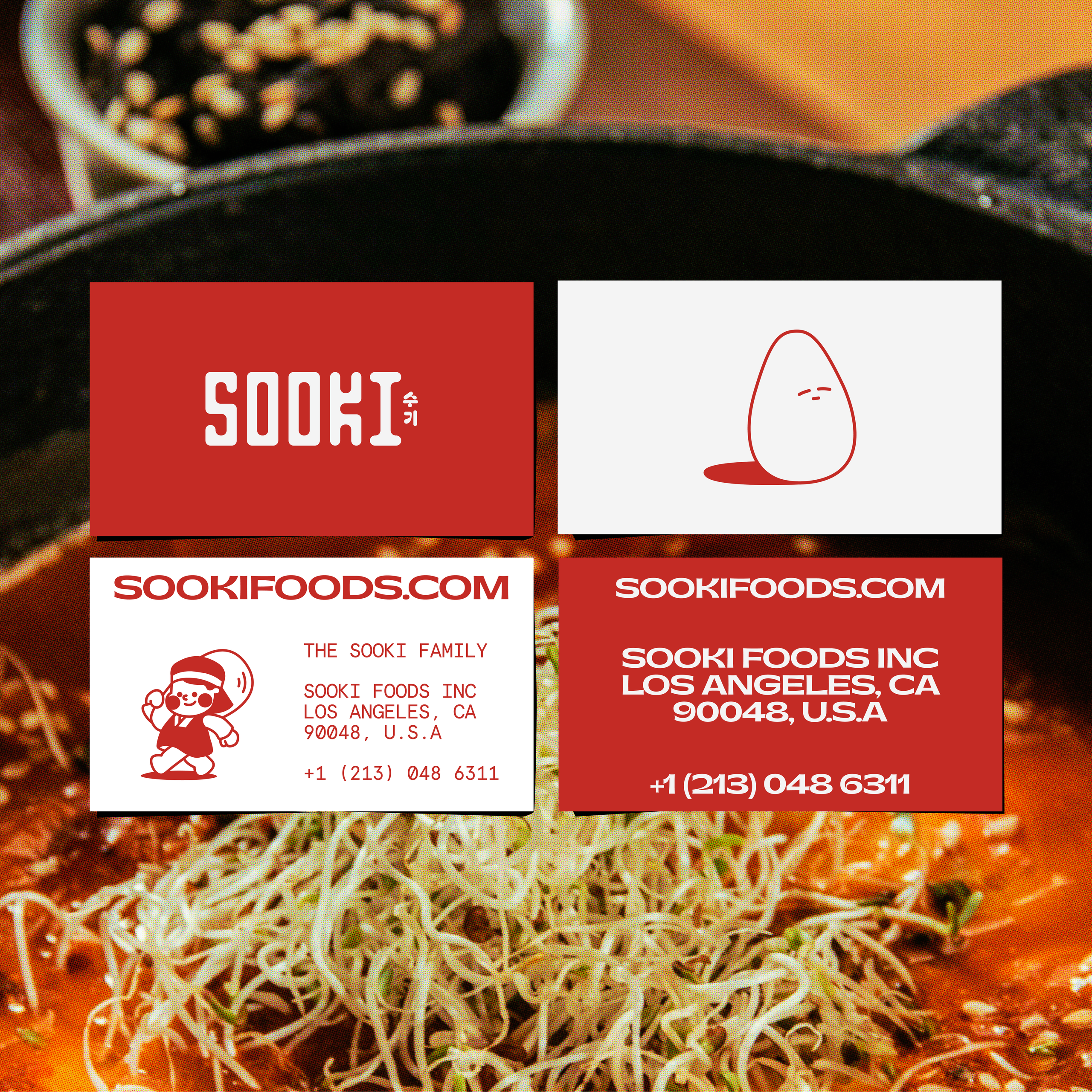
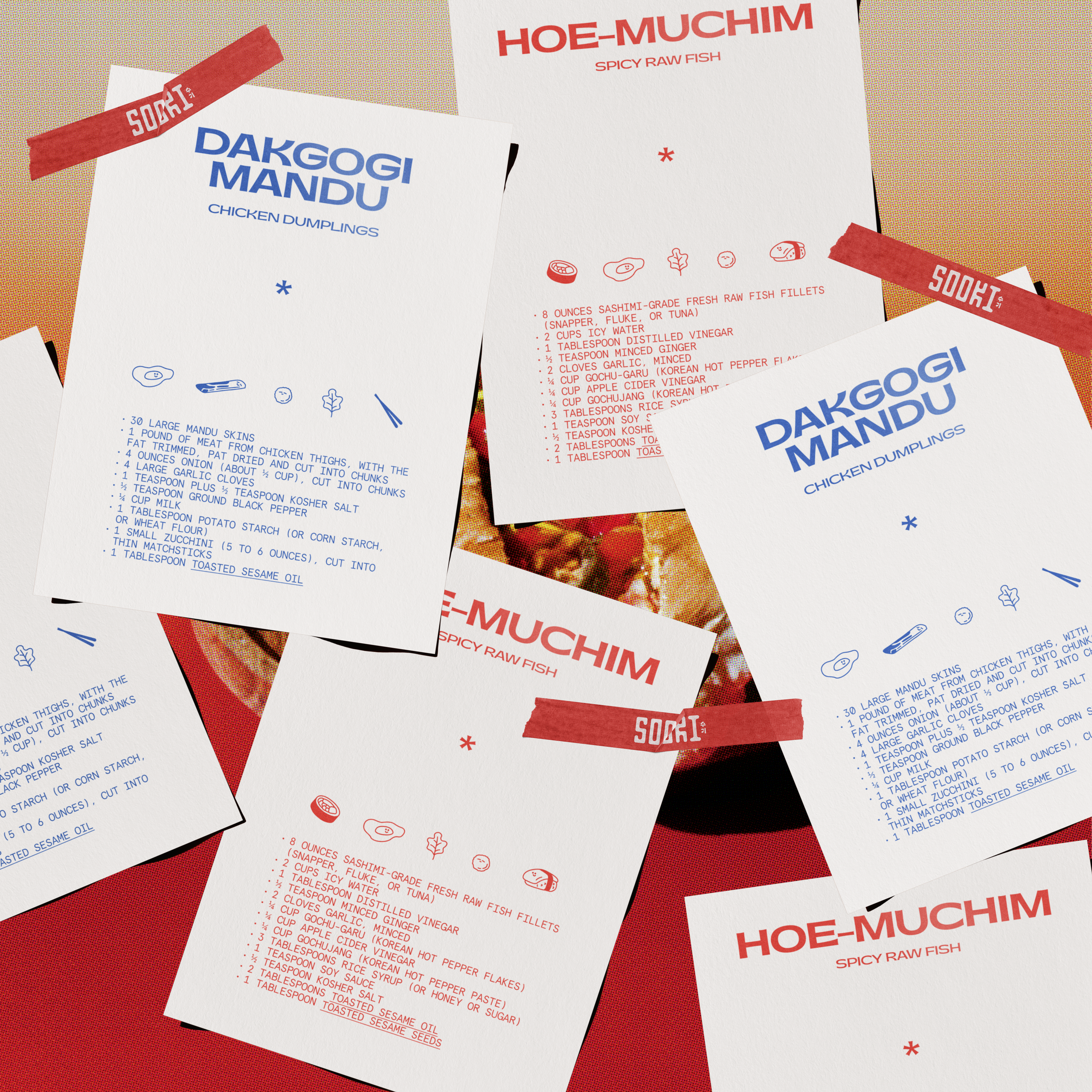
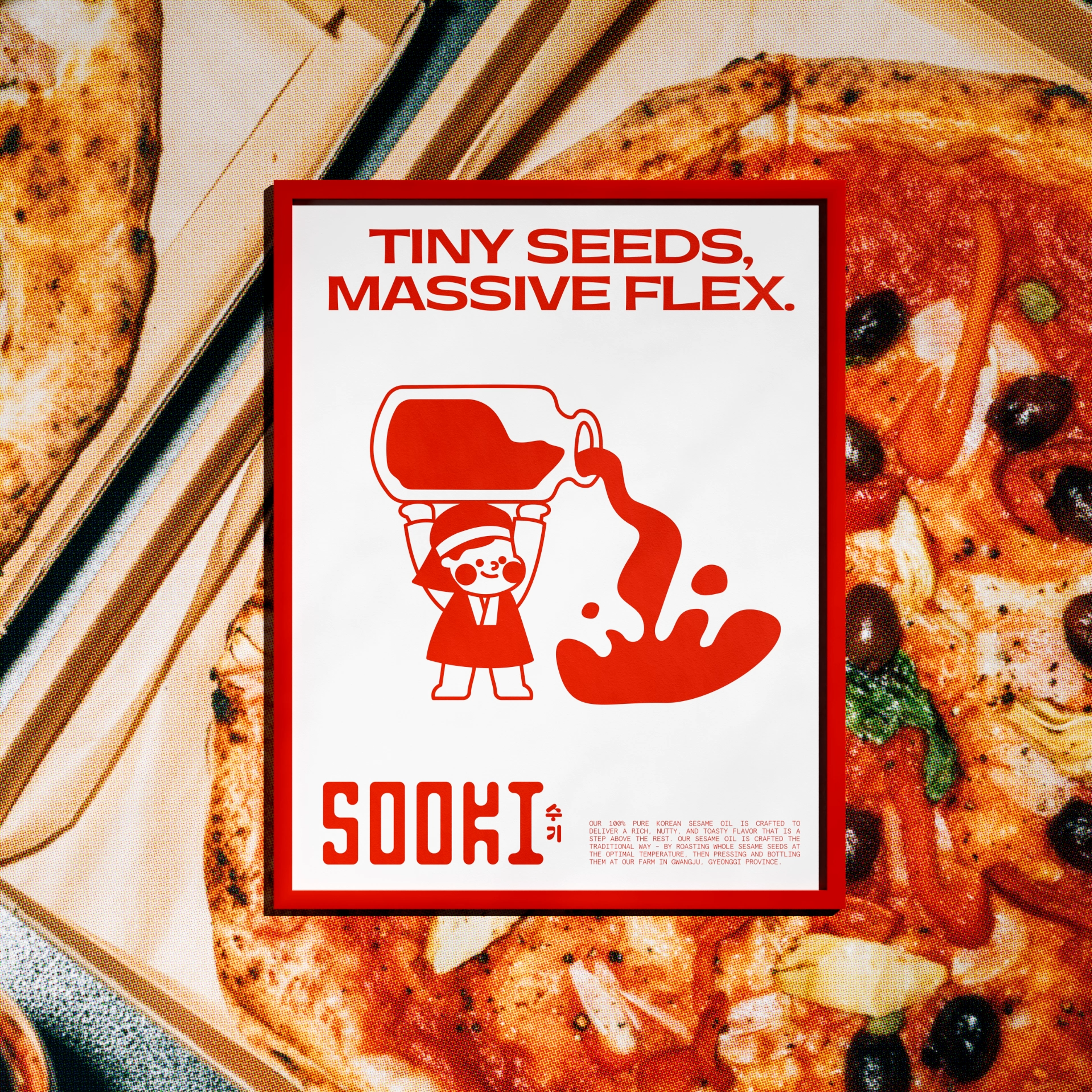
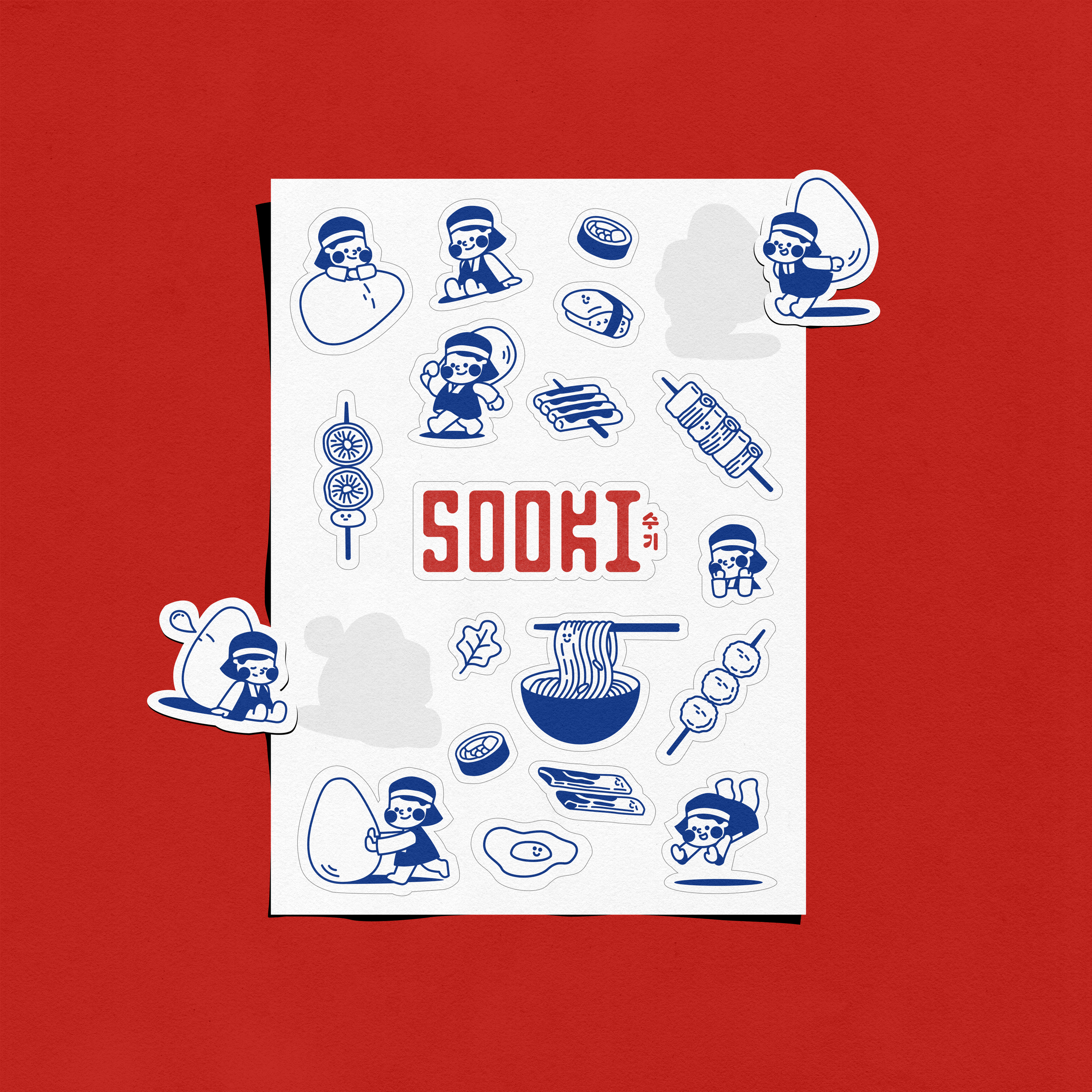
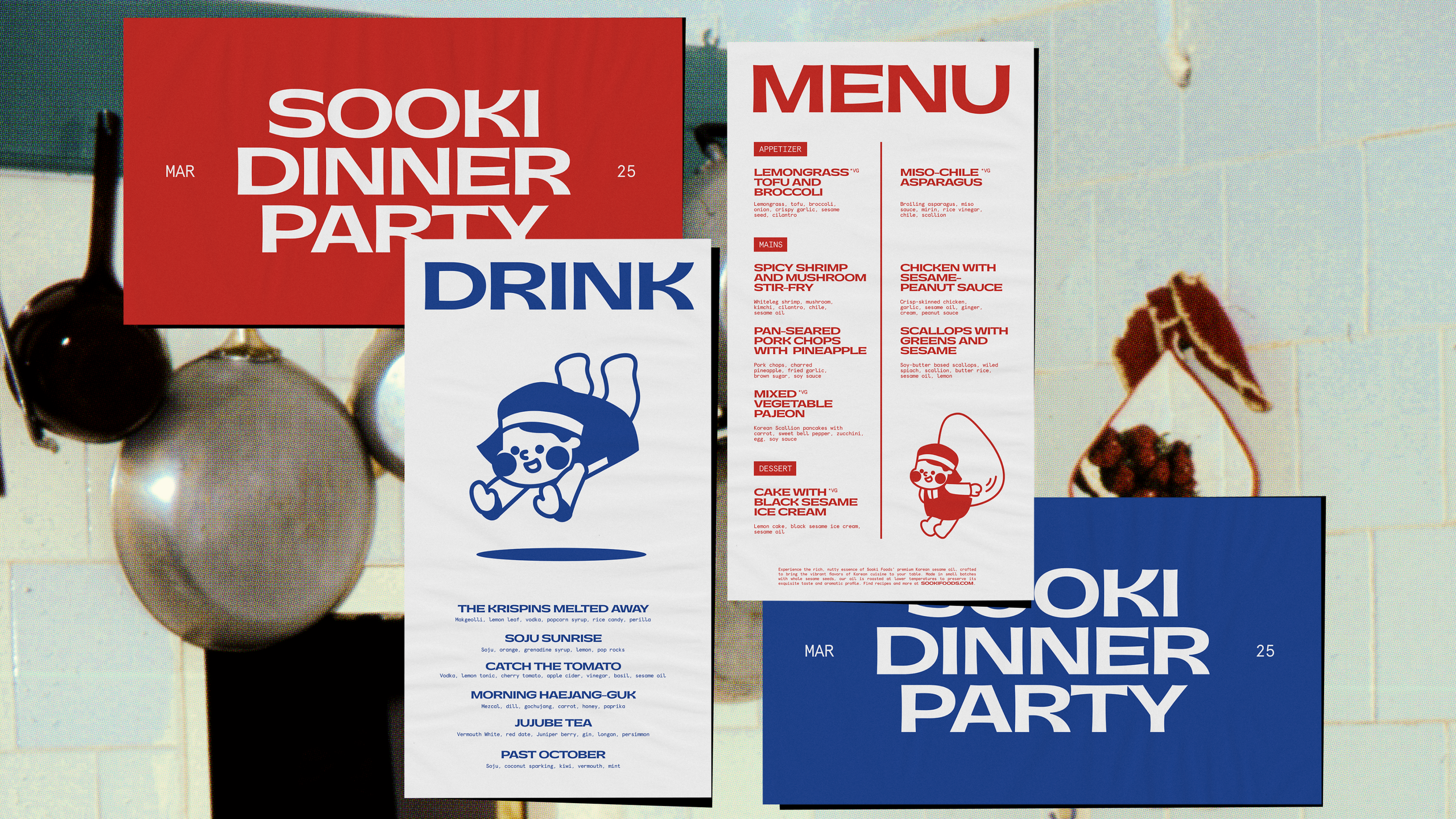
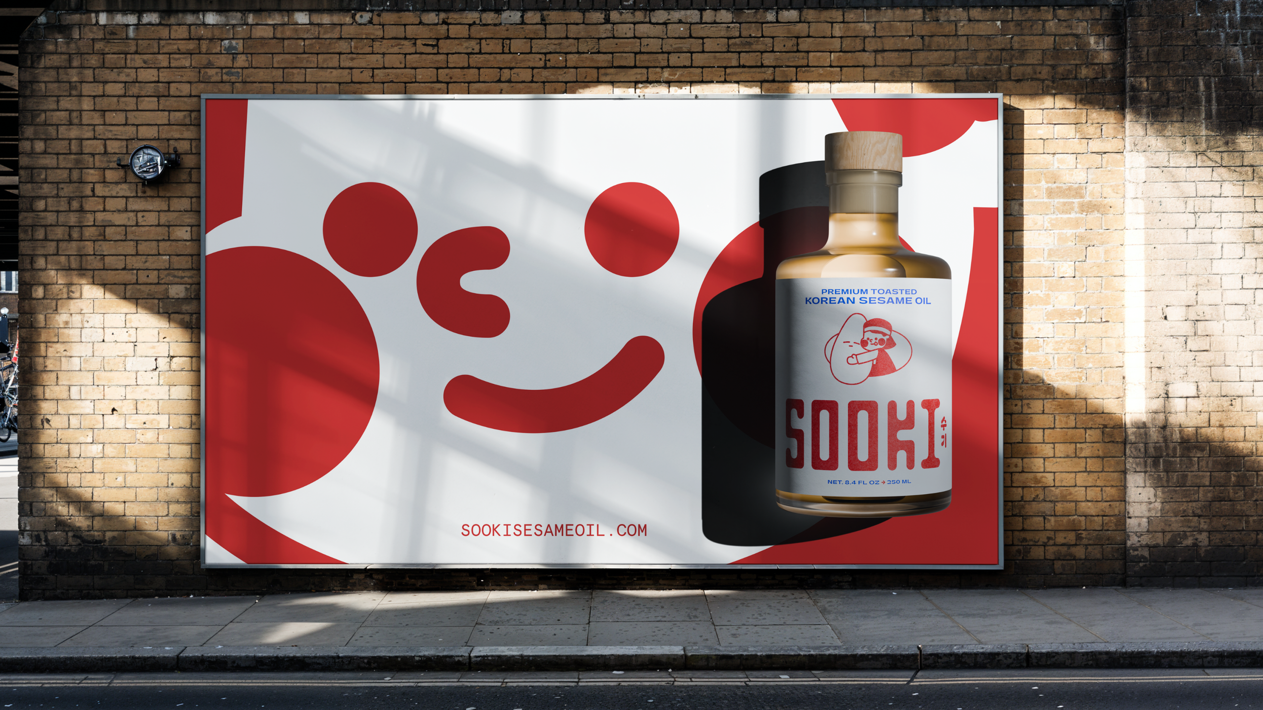
An identity and package for Sooki sesame oil, with a custom wordmark, a retro palette, and a delightful cast of hand-drawn characters.
Credits
- Design, 3D, Motion, Packaging Christian Townsend
- Design, Illustration Zedan Peng
- Studio The Collected Works
- Client Sooki Foods
- Tools Figma, InDesign, Illustrator, Blender
- Brief
Joseph and Hannah Choi approached us about bringing their family's sesame oil to market. They named it Sooki, their nickname for their mother. It's pressed and bottled in South Korea, where the seeds are roasted in small batches at a lower temperature than most sesame oils and pressed without solvents, which gives it a golden color and a smooth, buttery flavor without any bitterness. It's always fun to design something that's going to exist in the real world, and it's especially fun when the product is great. Sooki is truly the best sesame oil I've tried, and by a wide margin. They needed an identity and a package that could live up to it.
- Solution
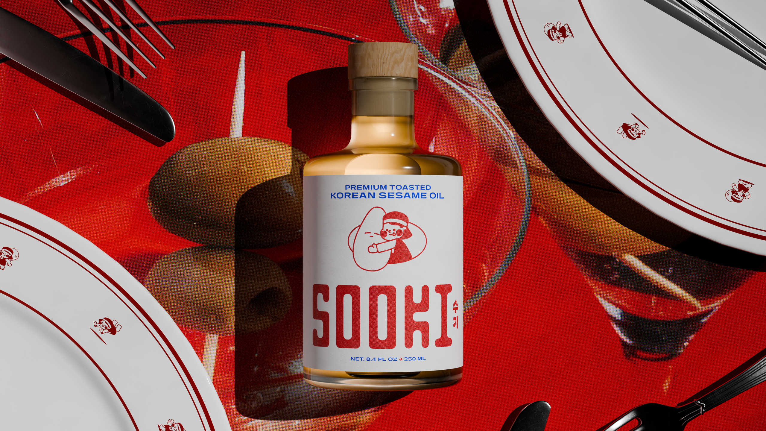
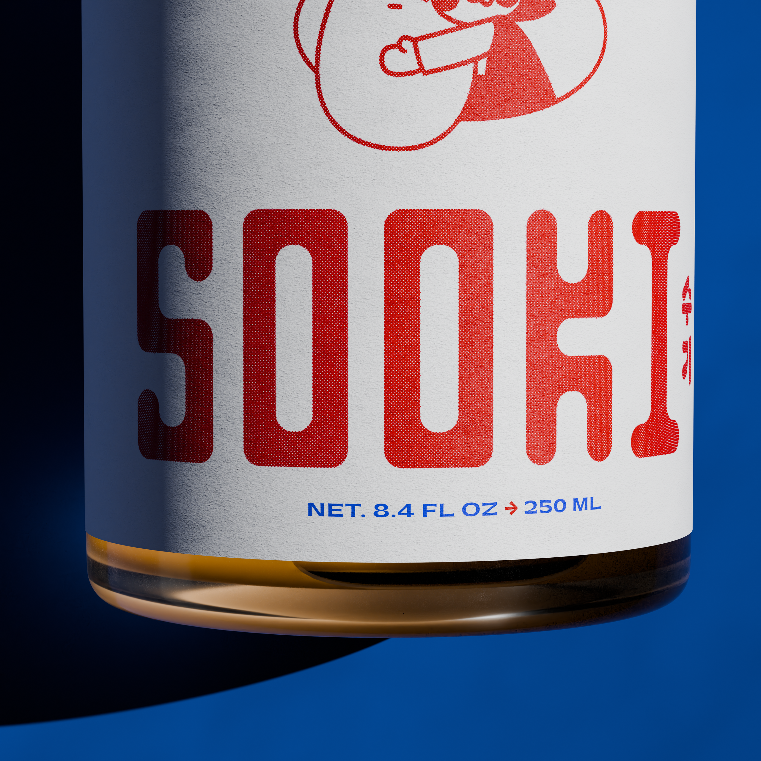
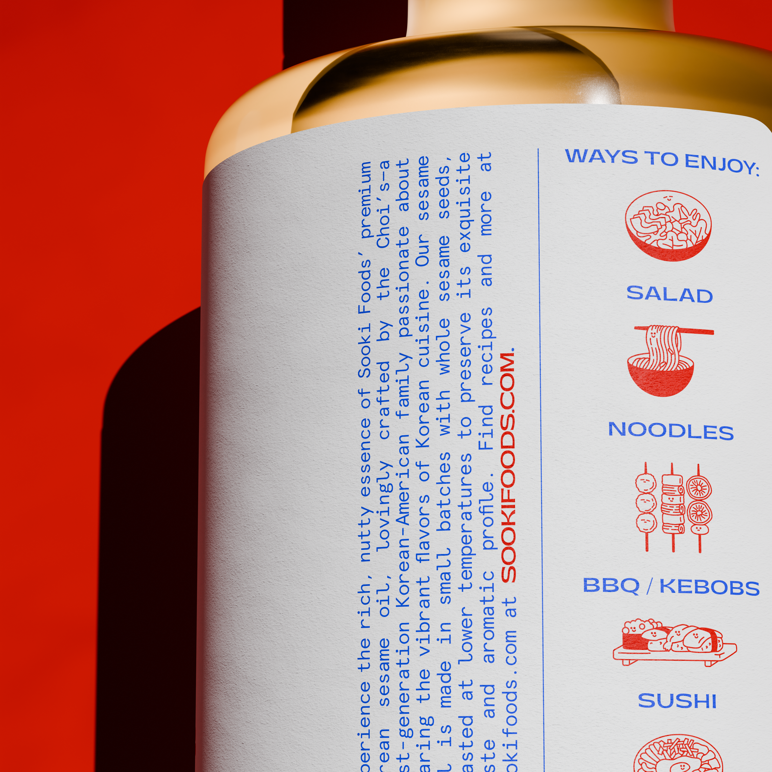
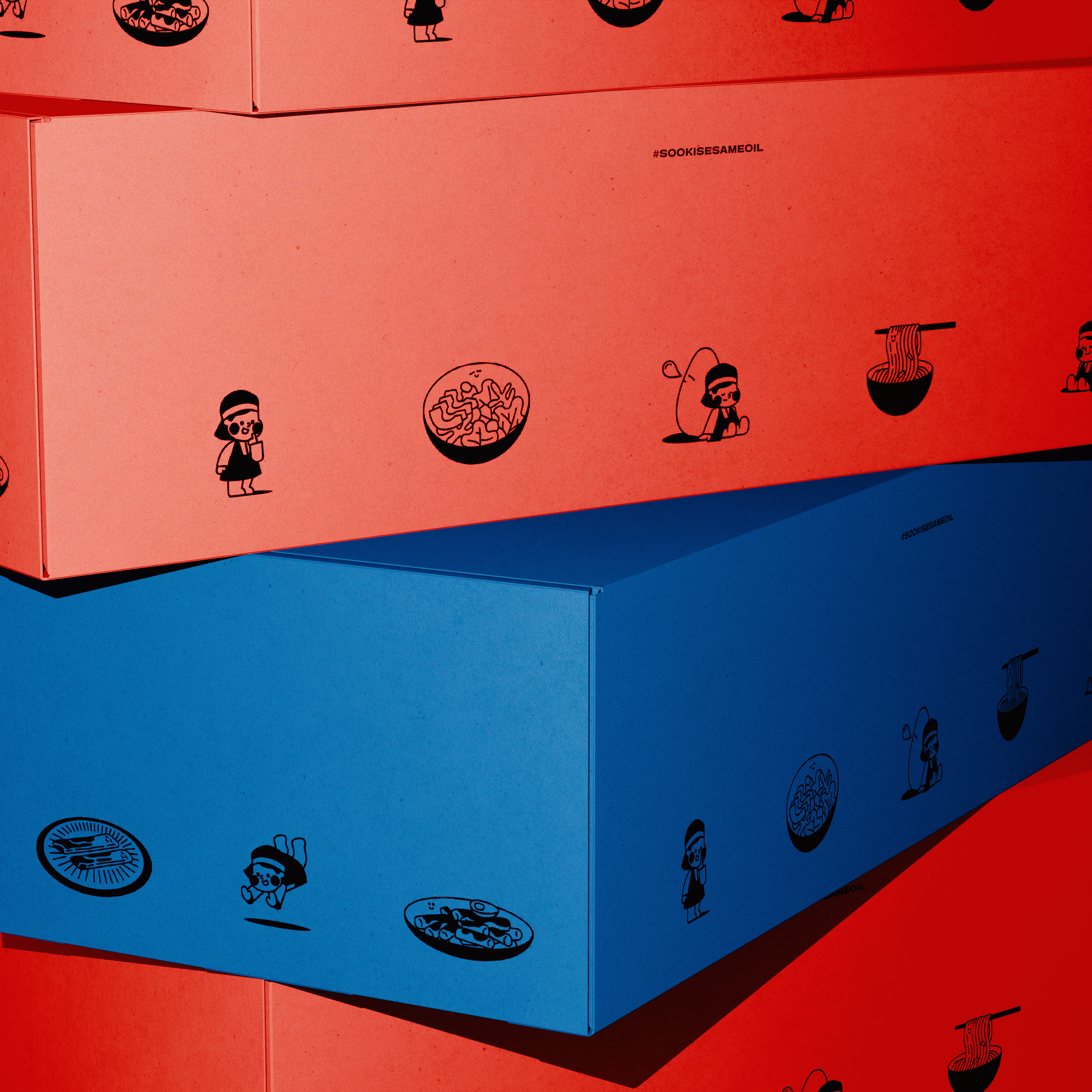
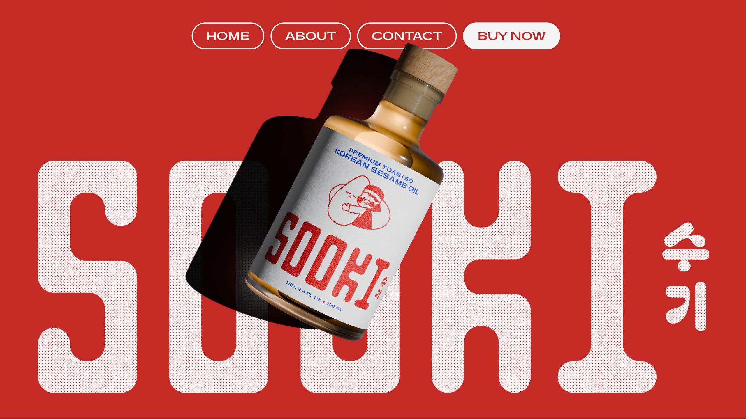
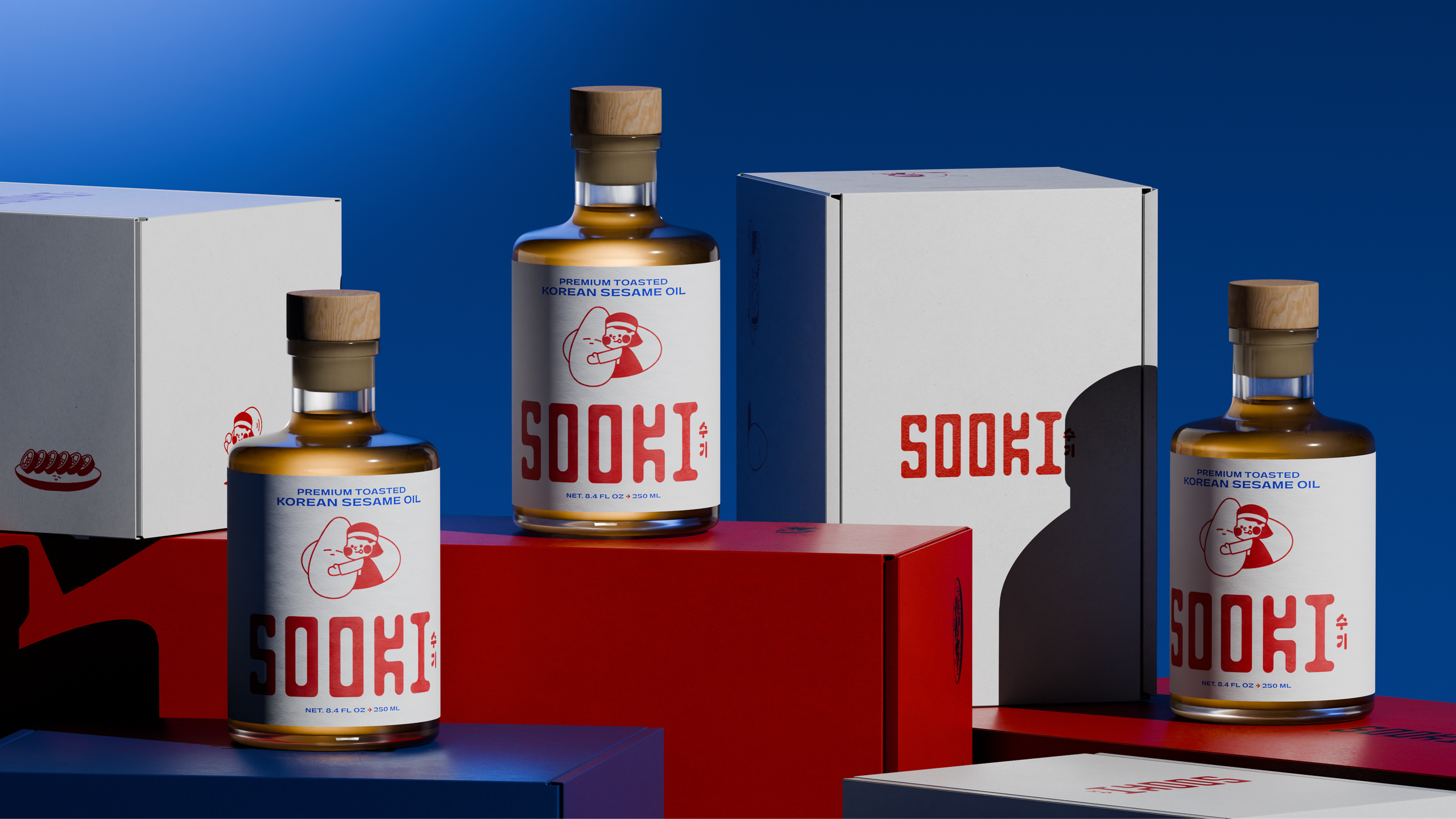
We worked closely with Joseph and Hannah on an identity and package built around what they wanted the company to represent: respect for heritage, openness to the present, and a sense of fun along the way. We drew a custom wordmark, and to bring in that sense of fun we gave the brand a cast of hand-drawn characters, illustrated by Zedan Peng, another designer at the studio. For the package, our goal was a beautiful object that people wouldn't mind leaving out on their counter, which led us to a small, weighted glass bottle with a wooden cap and a linen-finish label.
- My Role
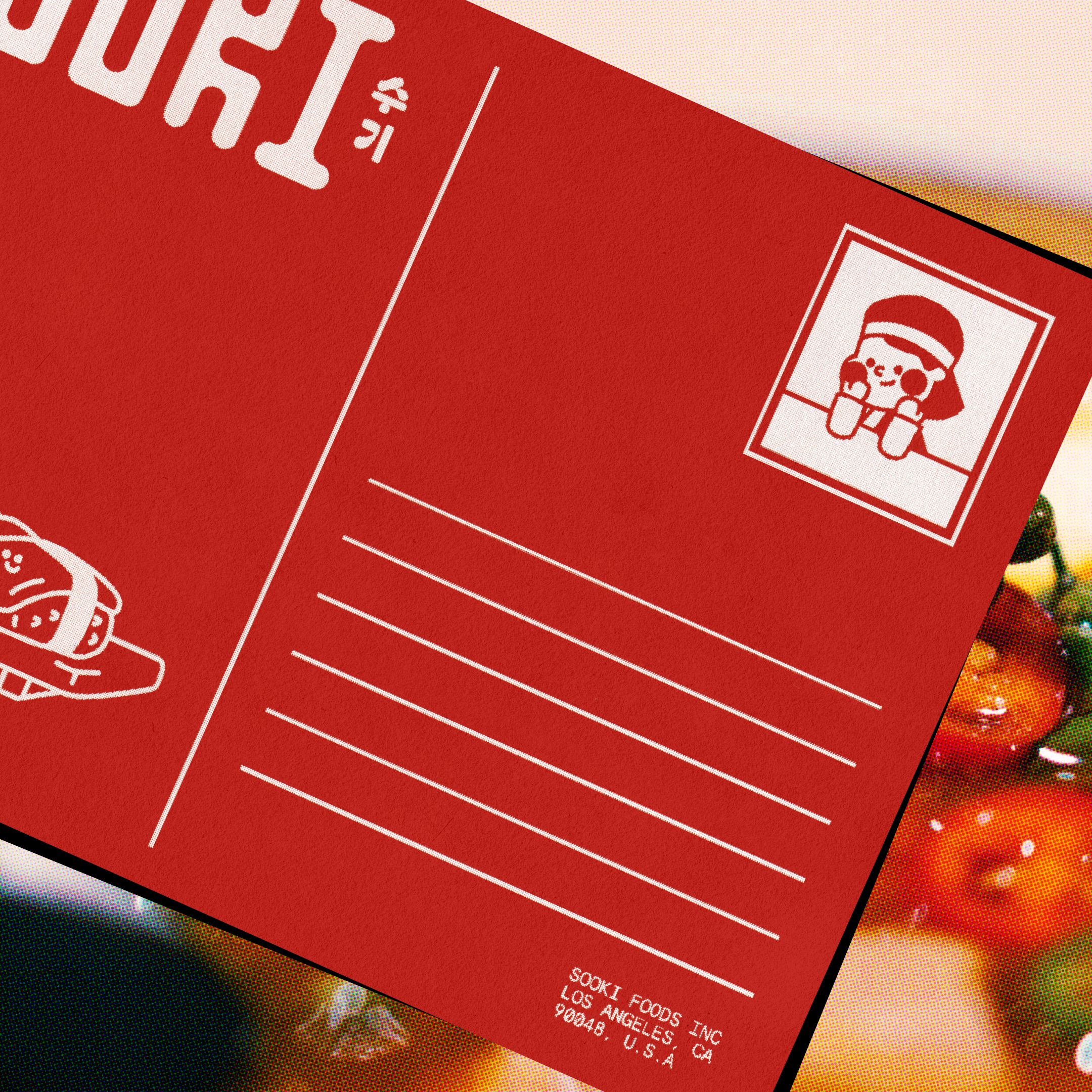
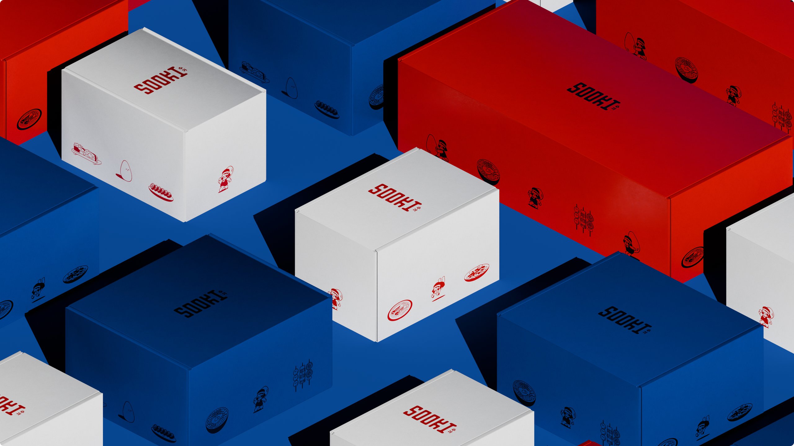
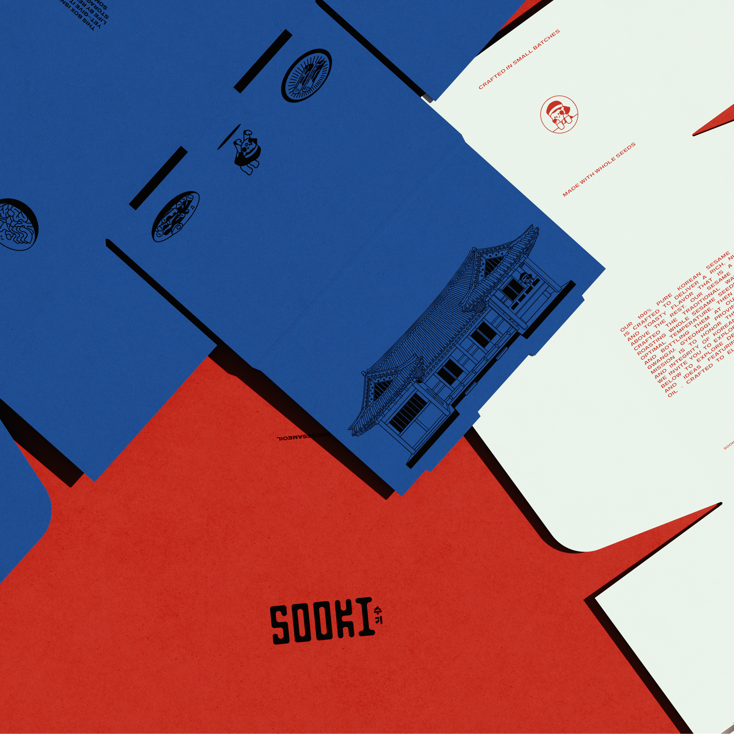
I was a designer on this project from the first round of directions through to the final files. I pitched multiple identity directions at the start, refined the lettering of the wordmark, and helped develop the chosen direction into what the Sooki team walked away with: a custom wordmark, a type system, a distinctive color palette that feels just a little bit retro, and a package they can be proud to put a fantastic product in. Early in the process, I modeled and rendered the bottle in 3D, which allowed us and the client to evaluate the package as a real object before anything was produced, and later gave them imagery for sales sheets, product listings, and their website and social channels. I also helped design the seeding boxes that went out to reviewers as part of their organic marketing.
- Colophon
- Year 2026
- Field Consumer
- Deliverables Brand Identity, Packaging, Illustration, 3D Renders, Sales Sheets, Seeding Boxes, Social Assets
- Typefaces Gatwick (Pangram Pangram), Apercu Mono (Colophon Foundry)
- Bottle Weighted glass with a wooden cap
- Label Linen-finish paper